Enhancing Neon Signs with Color and Effects
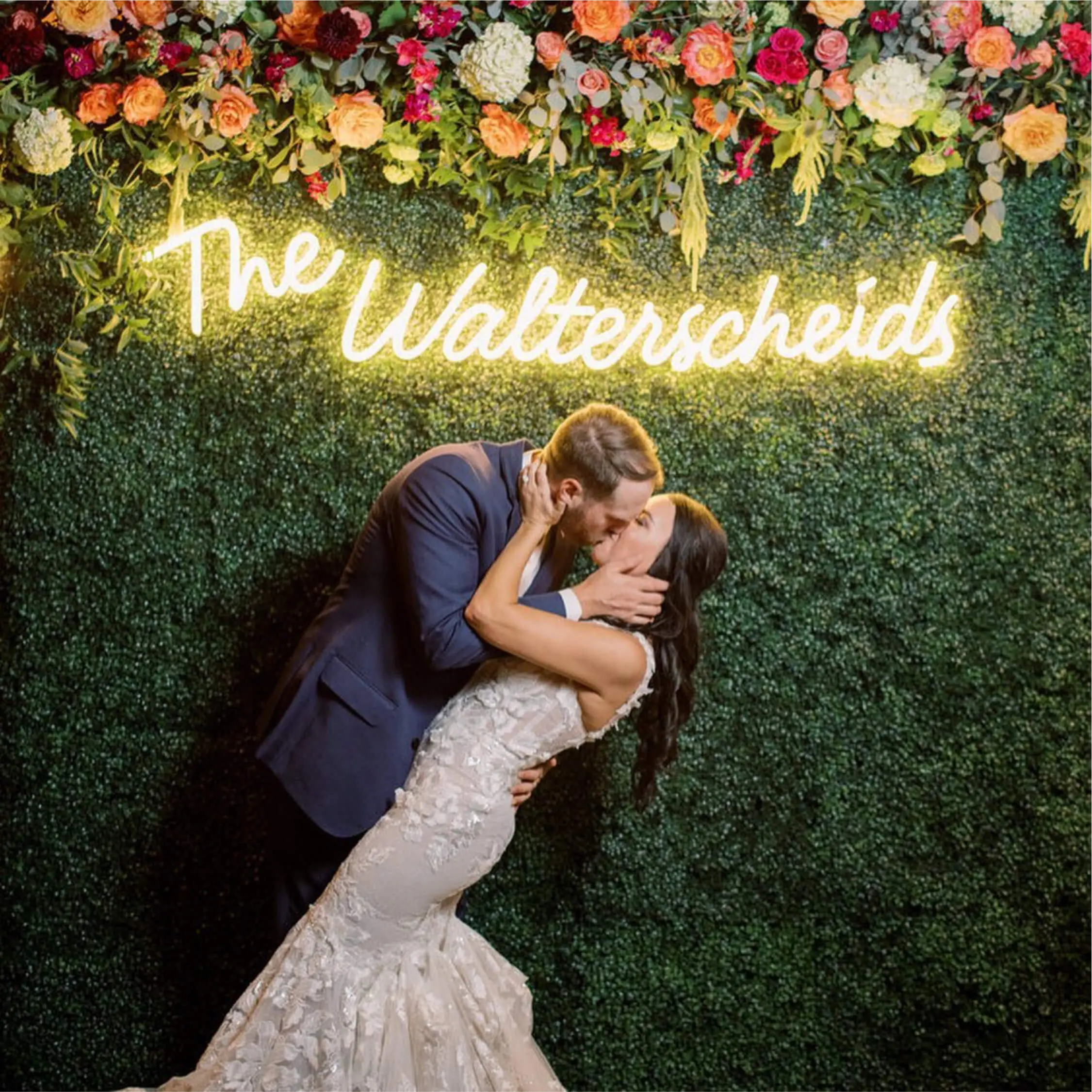
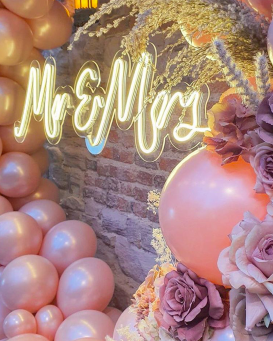
Color and effects play a significant role in enhancing the visual appeal of custom neon signs. By carefully selecting the right color palette and incorporating eye-catching effects, you can create personalized neon signage that truly stands out.
Impact of Color on Neon Signs
Colors have a profound impact on human emotions and perceptions, making them a crucial element in neon sign design. Different colors evoke different feelings and convey distinct messages. For example, warm colors like red and orange can create a sense of excitement and urgency, while cool colors like blue and green evoke calmness and tranquility.
When choosing the right color palette for your neon signs, consider the following tips:
Reflect your brand: Select colors that align with your brand's personality and values.
Create contrast: Use contrasting colors to make your signage more visually striking.
Consider readability: Ensure that the chosen color combination doesn't compromise legibility.
Test in different lighting conditions: Colors may appear differently under various lighting situations, so test your design in different environments.
By understanding the psychology of colors and their impact on viewers, you can effectively communicate your message through custom neon signs.
Adding Effects to Neon Signs
In addition to color, adding effects to your neon signs can further enhance their visual appeal. Effects such as flickering, flashing, or glowing animations can create an eye-catching display that captures attention.
Experimenting with different effects allows you to create unique designs that reflect your style or project theme. However, it's important to strike a balance between creativity and readability. Ensure that the effects you choose do not compromise the legibility of your signage or distract from its intended message.
By combining color psychology with creative effects, you can elevate the impact of custom neon signs and create bespoke displays that leave a lasting impression.


